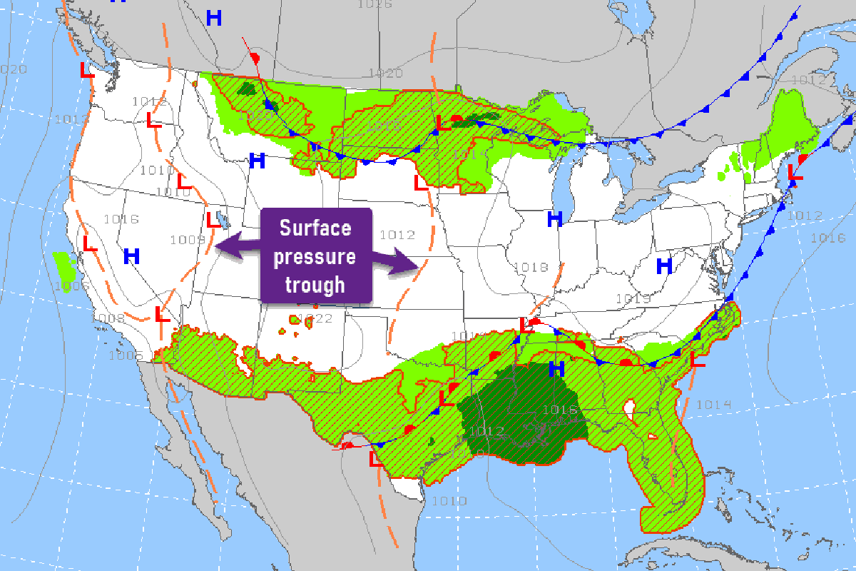

Q: The PROG charts on the aviationweather.gov site depict a dotted yellow line shown as “troughs.” The location is seemingly random and sometimes between two closely positioned high pressure areas with no forecast precipitation and doubtful significant weather at those spots. Can you explain why this is important enough to depict on the PROG charts? How should I use the location of troughs information in my flight planning?
A: Before every flight, pilots should become familiar with the latest surface analysis and PROG charts to identify the major weather systems that are expected to affect the conterminous U.S. and southern Canada. These charts are made available on the aviationweather.gov and wpc.ncep.noaa.gov websites and depict an isobaric analysis—or forecast of pressure (in millibars) adjusted to mean sea level—that includes a few familiar features such as high and low pressure centers, as well as the location and type of surface frontal zones. They also may include a few unfamiliar features such as drylines, squall lines, convective outflow boundaries, intermediate isobars, and what are referred to as surface pressure troughs.
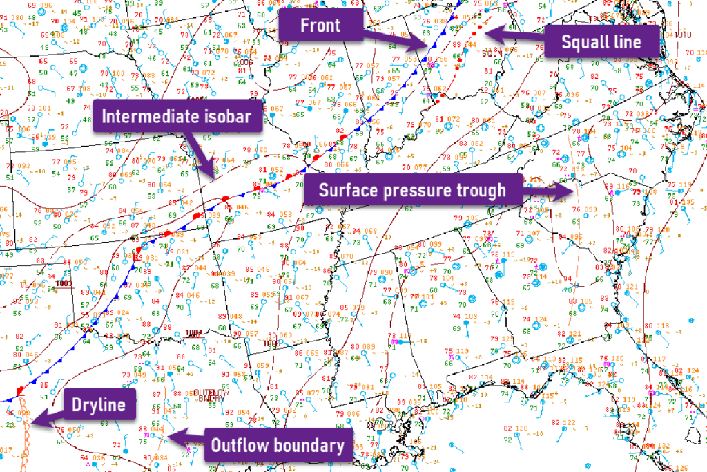
In general terms, a trough is simply an elongated area of low pressure with no distinct low-level pressure center. A trough is an axis (line) that defines both a wind shift and pressure change like a frontal zone.