











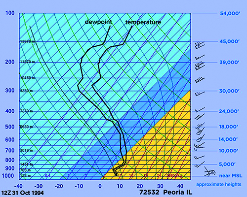


Last month, we took a close look at Skew-T (sounding) diagrams and how they’re constructed. To refresh your memory, Skew-T’s are simply diagrams showing a vertical profile of temperature and moisture at a given station at a given time. The up direction is increasing altitude, and the right-hand direction is increasing temperature or moisture. The data for the diagram is most often obtained using balloonlaunched radiosondes, but simulated Skew-Ts can be produced using analysis and numerical models.
These diagrams might seem intimidating, but they’re very easily found on the Internet, and sites like Pivotal‑Weather.com let you click on the numerical forecast maps along your route of flight and see a Skew-T. They can easily be brought up on any phone or tablet, and they’re provided as a single image that literally gives a myriad of keys and clues to the forecast puzzle unlike any other weather chart. How could you not pass this up?