











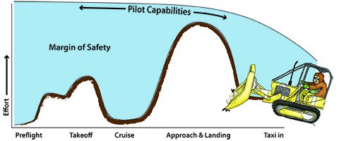


Picture one of those ubiquitous human factors graphs that show pilot workload during a flight. The x-axis shows startup through shutdown. On the y axis, is a scale of pilot workload: relatively low during taxi, a significant spike during takeoff and departure, a long, low flat line for cruise, an even bigger spike for approach and landing and an anti-climactic taper-off for taxi in. At the top of the graph, there’s an additional line that starts high and arcs slowly down representing the pilot’s capabilities.